
VIVID VINYL
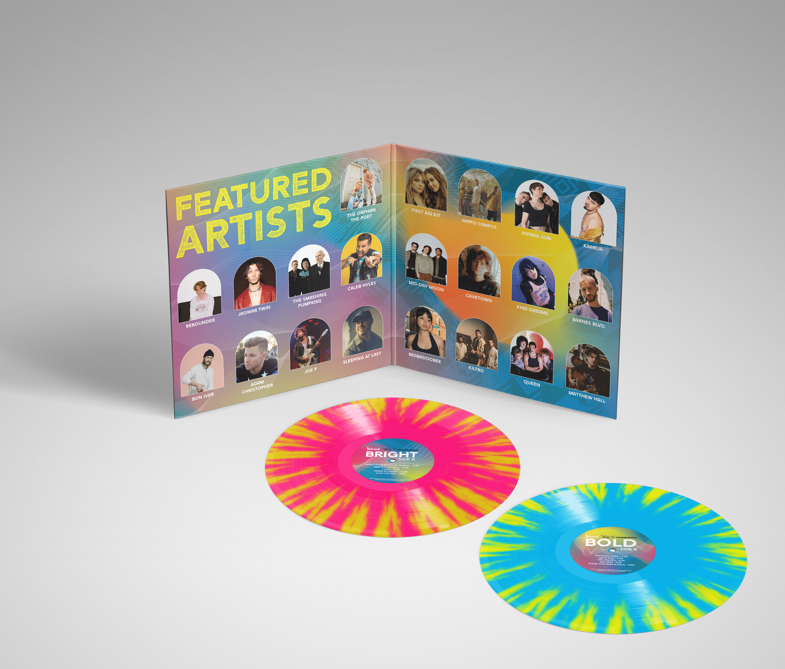
I have always enjoyed creating projects that integrate music as a main theme. Using The Secret Life of Colors as a reference, I chose 10 colors with interesting backgrounds and meanings. I then took those colors and created custom playlists for each, using their underlying meanings to guide the theme—drawing inspiration from the concept of synesthesia, where senses like color and sound can become linked.
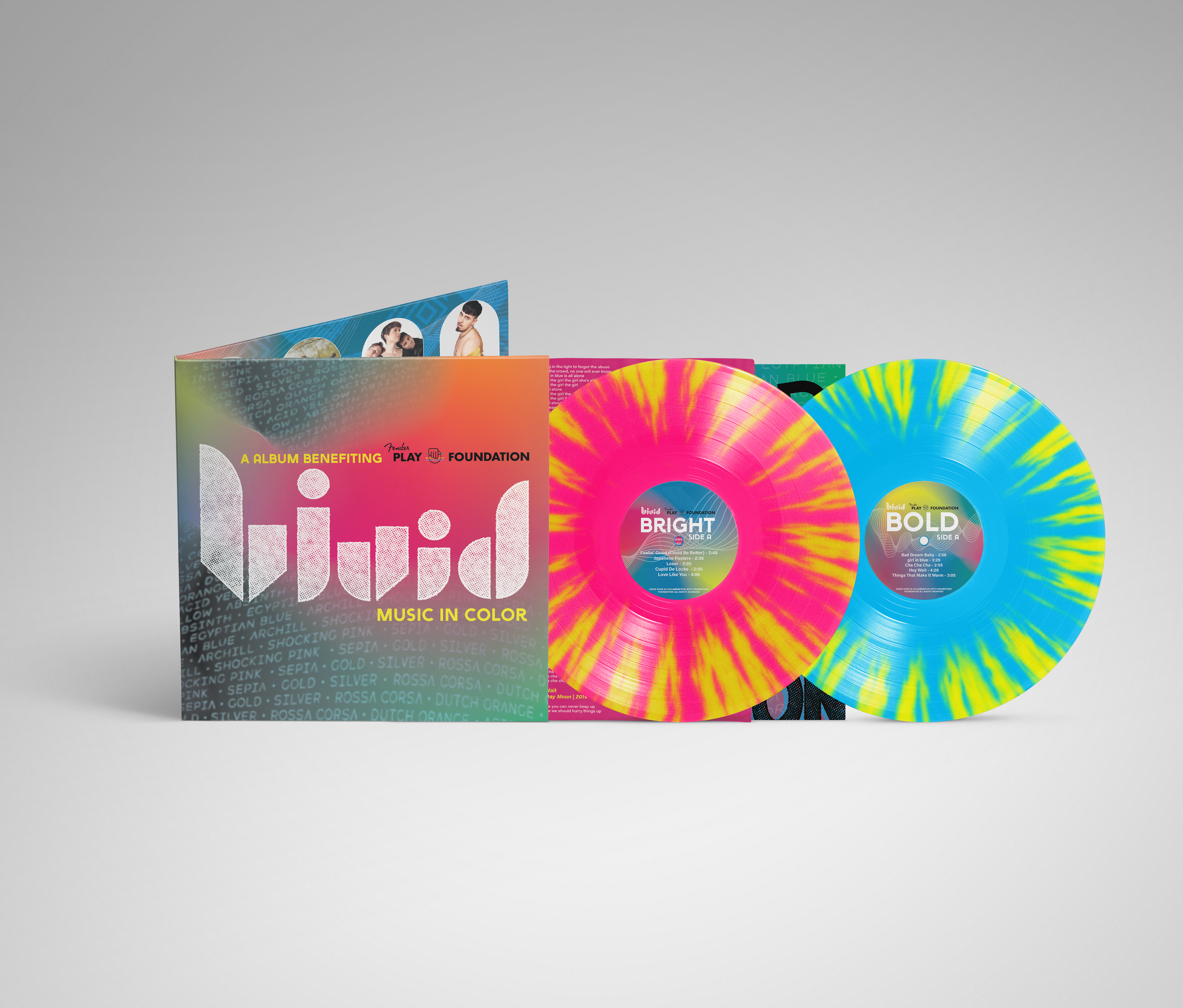
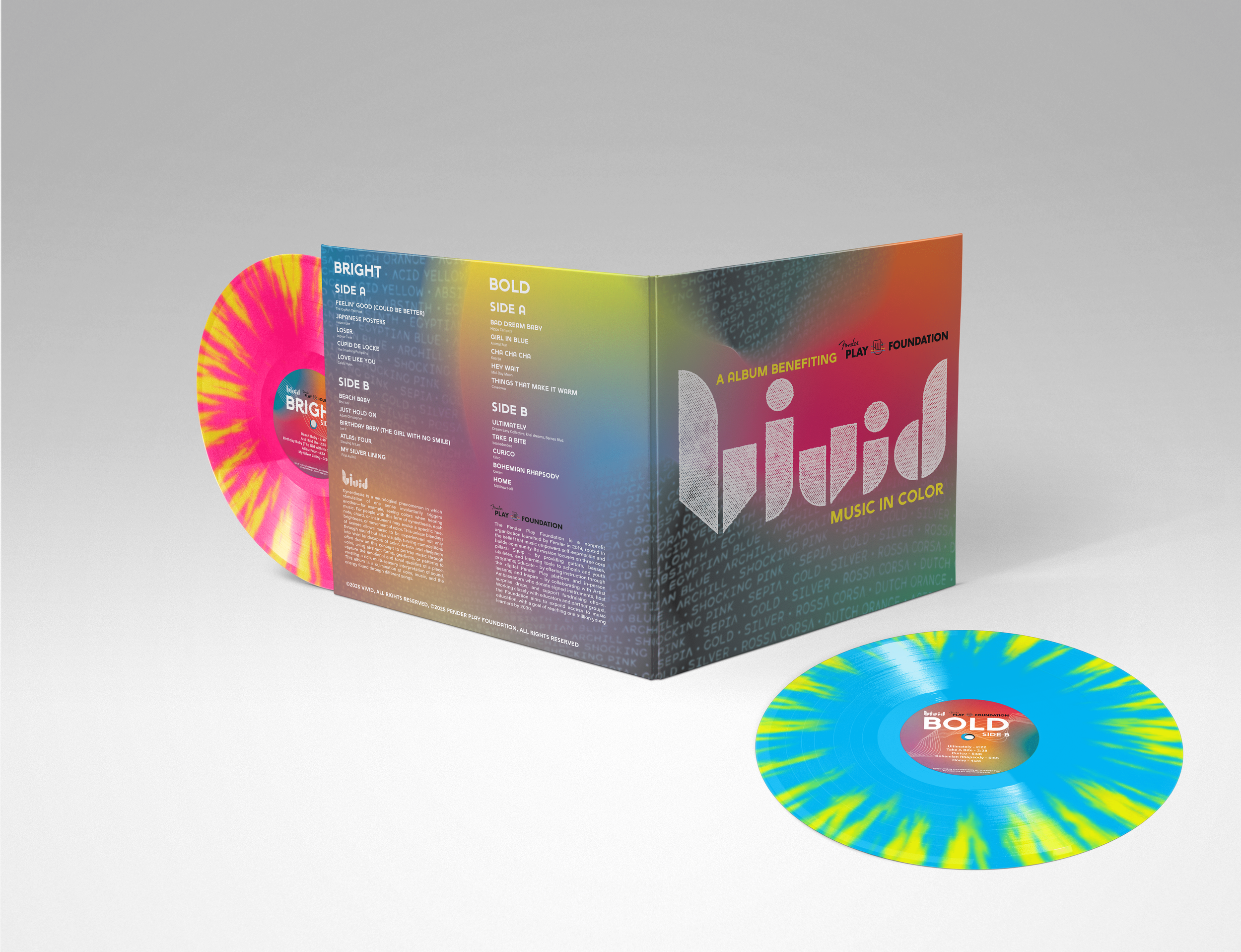
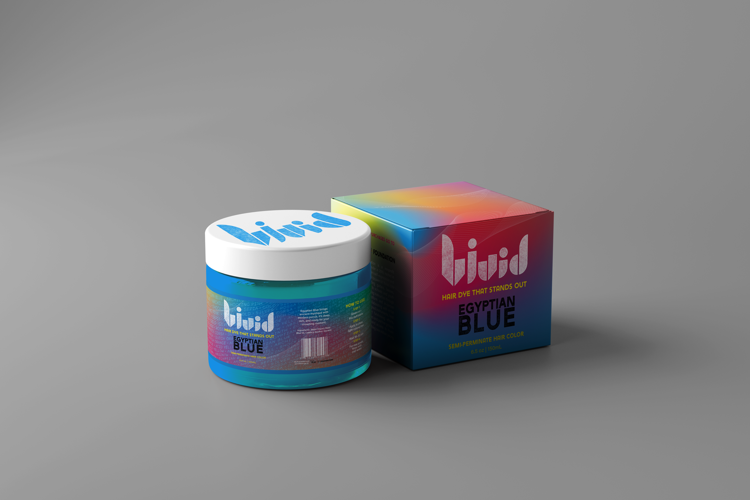
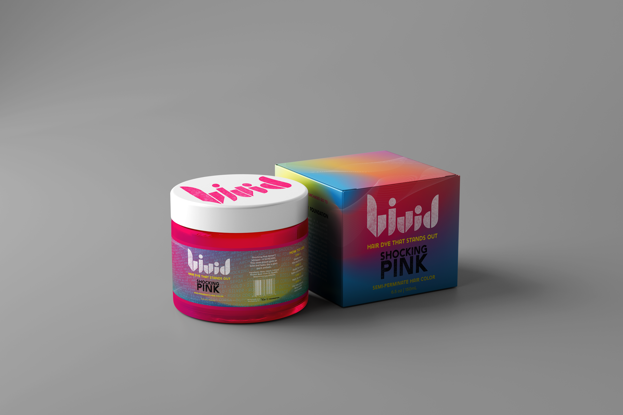
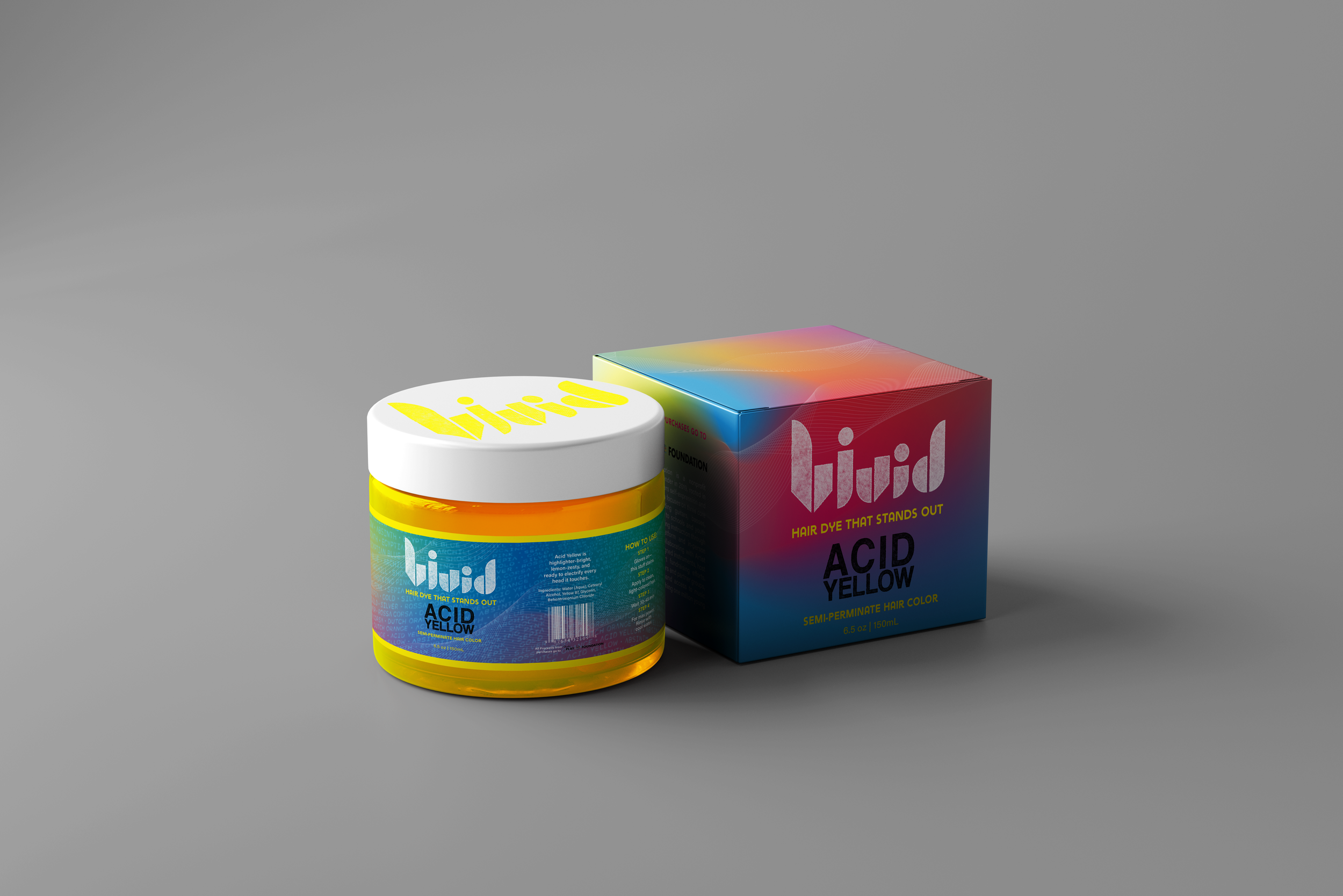
Building on the idea of synesthesia and the nostalgic feeling of music in motion, I created gradients for each color and used their names as texture throughout the design. To reflect a more punk-inspired theme, I incorporated halftone patterns into the title and logo text, echoing the look of Spotify codes. The concept of designing hair dye packaging was also meant to align with this bold, expressive aesthetic.
Reflecting on the final outcome, this project pushed me to explore new creative territory—both technically and conceptually. While there were challenges in translating abstract ideas like synesthesia into physical design elements, I found the process rewarding and eye-opening. The final visuals and playlists felt cohesive with the themes I set out to explore.
Meaning of the Vinyl
Synesthesia is a neurological phenomenon in which stimulation of one sense involuntarily triggers another—for example, seeing colors when hearing music. For people with this form of synesthesia, each note, chord, or instrument may evoke a specific hue, brightness, or movement of color. This unique blending of senses allows music to be experienced not only through sound but also visually, turning compositions into vivid landscapes of color. Artists and designers often draw on this concept to portray music through color, using abstract forms, gradients, or patterns to capture the emotional and tonal qualities of a piece, creating a rich, multi-sensory interpretation of sound. This album is a culmination of color, music, and the energy found through different songs.
Brand & Logo Creation
Having the name “Vivid” meant the colors I chose for the branding would need to stand out and elicit attention.